It is amazing how the presentation of data impacts the usefulness of that data. It makes sense in that you need people to actually read and use the data for it to take on meaning and purpose. The look and feel of how the data is presented impacts whether or not a user consumes it, so to speak. Especially in my newer role in strategic marketing, I find it interesting trying to discern how to present data in an easy-to-consume style.
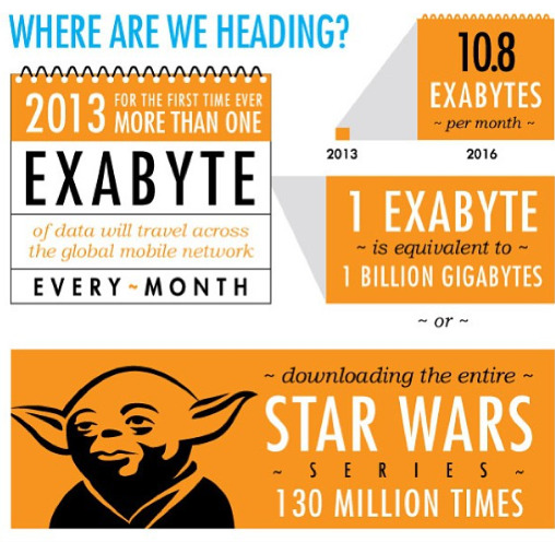
I was thinking about this recently when looking at CommScope's new infographic, "The Evolution of the G." I think the infographic format is a nice way to present info. It tells a story in a few images, words and stats. It covers a lot of content in a relatively concise way. There's a nice flow to it.
"The Evolution of the G" infographic tells the story about the evolution of wireless networks. It shows how much faster 4G networks are than the first generation, and how much more traffic travels across them. It ends with a good reminder about what factor is most important when trying to keep smartphone users happy-network performance. Optimizing network performance, simplifying the evolution and delivering consistent results is what CommScope does for its customers.
But words don't always capture that the best. As an early 20th century American editor first said (according to Wikipedia), "A picture is worth a 1,000 words." I'm already thinking of other visually creative ways of telling the wireless industry and CommScope stories.
What do you think of our infographic? Does it represent the evolution of wireless well? How will the tremendous growth of mobile traffic impact future networks?


